demonstration reports
On this page you can find reports of artist demonstrations at our monthly meetings. Please visit Programme and Events to find out what demonstrations are happening when and Join Us to become a member of Beccles Society of Artists/attend a meeting.
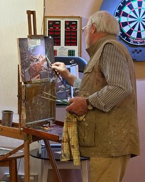
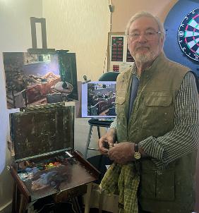
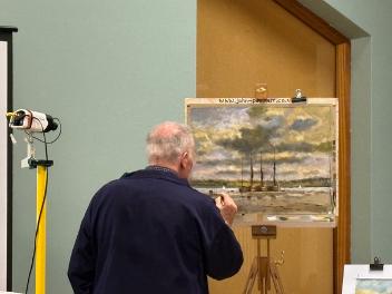
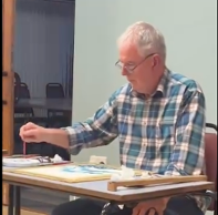
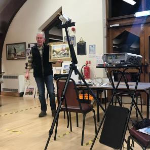
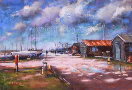
may 2026 - jim power
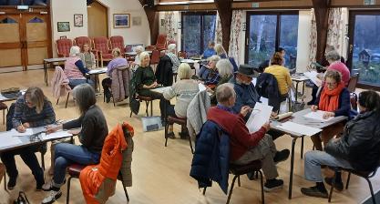
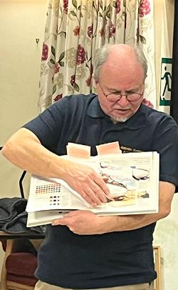
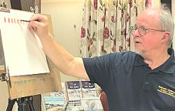
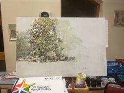
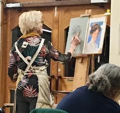
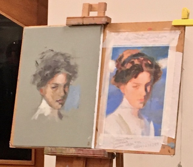
“An interior in oils" - a demonstration by Jim Power
With all the members of the Beccles Society of Art huddled around Jim's easel in the lounge room of The Club, we were treated to a very informative and enjoyable demonstration.
Jim began by emphasising the importance of 'composition', 'perspective' and 'tone' when tackling the subject of Interiors.
He started by using a mid-toned board on which he made a simple linear construction using a diluted oil paint mixture of Ultramarine Blue and Umber.
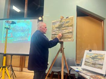
Jim doesn't believe in making an exact copy of whatever he is looking at, but rather prefers to 'interpret' a particular scene. He referred to a painting by Ken Howard for inspiration, which was full of suggestions rather than literal depictions. "One of the fundamental rules for oil painting is establishing the dark tones first by scumbling loosely using thin mixtures", Jim told us. He used 3 different brushes so as to keep his colours relatively clean and used Gryfin White which was fast drying.
We all watched as Jim confidently and quickly developed his painting of an interior and by the end of the evening everyone agreed that we had learned so much in such a short space of time.
Report by John Patchett
april 2026 - malcolm cudmore
Like many other Groups in Beccles, we found it necessary to find an alternative venue due to the closure of the Waveney Centre. We were fortunate in that The Club, located in London Road, has been able to accommodate us for our last two meetings, the March meeting being an extra informal ‘Bring your own work’ or work with supplied subjects and materials. This was once again a very enjoyable sociable evening.
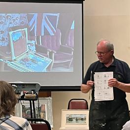
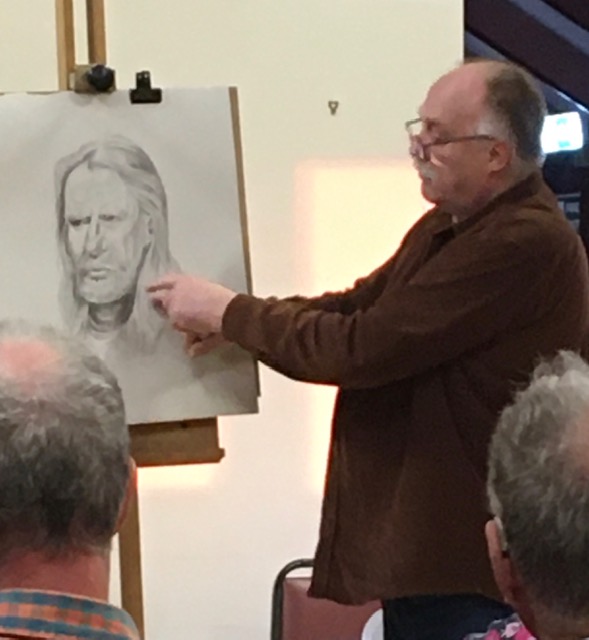
The next meeting on the 15th April proved very different. Malcolm Cudmore demonstrated portraiture using the digital drawing programme “Procreate” which is available for iPad or mobile.
Malcolm demonstrated the variety of tools available within the programme and the way the brushes, pens and pencils could be used, how to change the texture, blend, and erase. Colours can be mixed and blended together using a specific tool. We were also given a few general tips and guidelines on good practice when creating portraits. An extremely interesting demonstration.
Picture of the month was by Jingjing Allen which can be seen in the notice board opposite the Kings Head. Next meeting will be at The Club, London Road, Beccles, 20th May, 7.15pm for 7.30pm start, when Jim Powers will be demonstrating a Parisienne café scene.
march 2026 - Elizabeth sol art
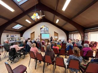
This month our meeting took place at the Public Hall due to the sudden closure of the Waveney Centre. Despite the foggy weather conditions there was a good turnout for the demonstration by Elizabeth Sol Art.
Elizabeth works in both watercolour and pastels and this evening’s demonstration focused on watercolour using the wet-on-wet technique. Elizabeth led us through the steps taken to produce her art pieces as well as sharing details of her favourite paints and equipment. The piece, a vivid sunset, was produced using a predominantly warm pallet of colours which continuously evolved, producing a stunning finished piece.
Picture of the month by Jane Webber is displayed on the notice board opposite the Kings Head.
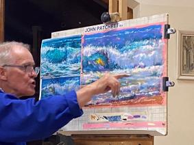
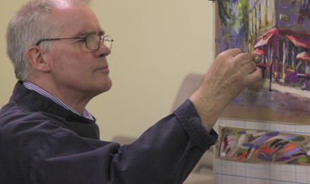
february 2026 - john patchett
The year opened with a bang as we once again welcomed one of our members, pastel artist John Patchett.
John discussed the various pastels available on the market and their differing properties and mark making. John also explained how he holds and works the pastels to achieve required results and also talked about suitable papers and how they affect the final outcome. The demonstration was done using a limited pallet of colours onto a coloured 400g paper and as the work progressed, we were shown differing techniques and given invaluable tips.
A really great demonstration from which we were able to take away a wealth of knowledge.
Some of the local galleries where John is currently exhibiting include Southwold Gallery, Swan House Hotel Beccles, and Ferini Gallery Pakefield.
Picture of the Month: Indian Girl by Pam Cross which can be viewed in the notice board opposite the Kings Head.
Next meeting 4th March at the Waveney Centre, Beccles, demonstration by Elizabeth SolArt, 7.15pm for 7.30pm start.
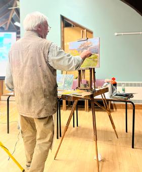
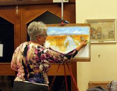
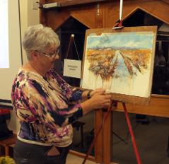
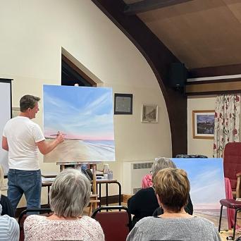
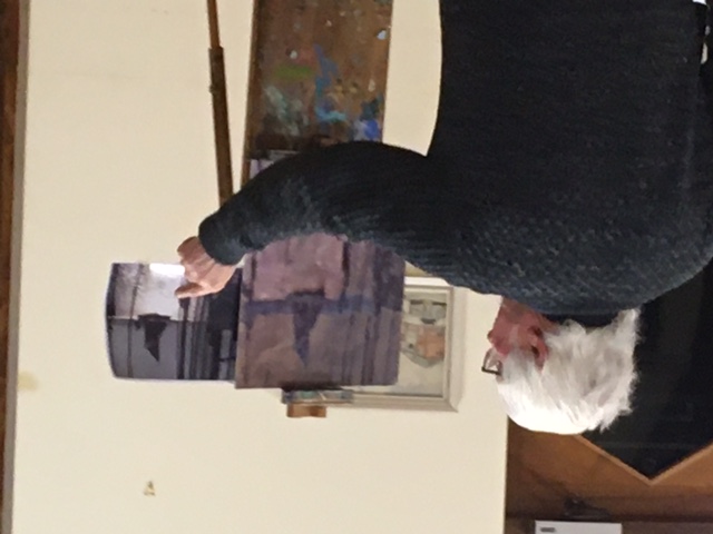
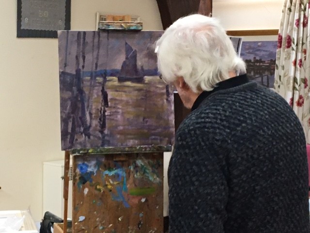
OCTOBER 2025 - JAMES POWER
Representational artist Jim Power visited the Society this month and demonstrated his landscape oil painting technique. In his early days as an Artist, Jim was influenced by Munnings and Seago and also teaches at the Munnings Museum.
Jim emphasised the importance of sectioning the page, determining the focal point and establishing strong horizon and landscape lines. He discussed the use of colour and the interaction between cool and warm colours demonstrating how they could be used to create depth, balance and a sense of atmosphere within the landscape and also spoke about the varying drying qualities of the different pigments and how they can affect layering and timing during the painting process. Also, how the choice of an underpainting tone can subtly influence the colour relationships and emotional atmosphere of the final work.
Overall, a most engaging and interesting demonstration.
Picture of the month was won by John Patchett and can be seen in the cabinet in New Market.
Next meeting: 5th November AGM at the Waveney Centre.
september 2025 - colin ayers
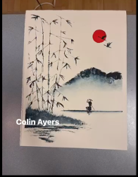
Beccles Society of Artists welcomed Colin Ayers to their meeting on the 3rd September and were rewarded with a most interesting demonstration on watercolour in the oriental Japanese style.
Colin showed, with both wet-on-wet and dry techniques and just three pigment choices, how to create the soft effects characteristic of Japanese landscape and floral painting. He also shared the various methods he uses to create texture and details of his preferred brushes and tools. A very informative and captivating demonstration.
Painting of the month was by Susan Simpson and can be seen in the cabinet in New Market during September.
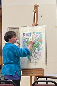
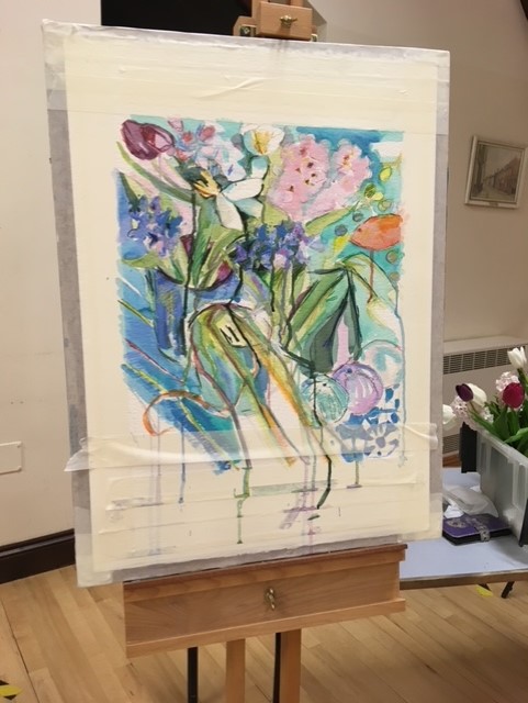
june 2025 - sue williams
This month at the Beccles Society of Artists June meeting, Sue Williams took us into the world of Acrylic Inks. We were treated to three separate demonstrations during the evening: a work in sepia, a vibrant work using warm colours, and a cooler colour piece focusing more on the blue palette.
Materials being demonstrated were Daler-Rowney and Magic, the latter being the thinner material. There was also a white opaque for highlighting and also could be used to cover errors as it was also possible to work over.
Because the inks are fairly fluid Sue would normally paint with the work flat to avoid unplanned runs, but as his was a demonstration which we all wanted to see, Sue had to work with the pieces upright on the easel.
It was fascinating to watch Sue drawing with a wooden tea stirrer, instead of her usual bamboo which would cause severe runs on the vertical surface, taking ink directly from the bottle and also using it to create texture as the ink was drying. Colours were also wetted and mixed onto a palette as well as being wetted on the page to soften or take out. Sue also moved and mixed colour directly on the page either with her fingers or one of her tools. Another trick to achieve texture was to sprinkle salt onto the surface whilst still wet.
Picture of the month is Sandra Crome which can be seen in the Society’s Notice Board in New Market, second John Patchett which you will find in the Waveney Centre.
Next meeting Wednesday 2nd July which will be Plein air sketching session. Bring your own equipment or there will be some available to use.
may 2025 - plein air at the waveney centre
Beccles Society of Artists welcomed Malcolm Cudmore to their 7th May meeting at the Waveney Centre, Beccles, when he gave a extremely enlightened talk and demonstration about his approach to working outside in oils.
We learnt about the equipment he takes with him and how he packs it for easy transport, the easel, oils, brushes, paper, mediums and all the other items he feels he needs whilst keeping things to the minimum. There were some very useful and interesting tips during the talk and the meeting was also able to watch Malcolm start a painting and hear how he approaches the piece.
Picture of the month by Halyna Klepikovska (can be seen displayed on the board in the Town Centre).
april 2025 - portrait sketching
Following the very interesting portraits demonstration in March, this month members took up their pencils, pens and pastels to try their hands at portraits Instead of the usual demonstration.
Members split into small groups and took turns to ‘sit’ for 20 minutes, which proved to be a lot more difficult than it seems, whilst their colleagues peered closely at them committing the images to paper.
It was a fun and sociable evening taking some members out of their comfort zone, trying something new and producing some great results.
Picture of the month – David Howe.
Next meeting Wednesday 7th May 7.30pm at the Waveney Centre when Malcolm Cudmore will be demonstrating oils Plein Air style. Full details on the website. Guests welcome.
march 2025 - liz balkwell
The Society welcomed East Anglian Artist Liz Balkwell to their meeting at the Waveney Centre in Beccles on 5thMarch. Liz works in pastels and oils and is well known for her portraiture pieces.
Liz spoke about the materials she uses, how she normally prepares for the work in terms of lighting, position of the sitter and their comfort. For a commissioned work Liz would have previously met the sitter but on this occasion, there was limited time so it was necessary to work fast. We were not disappointed and were treated to an interesting and informative demonstration taking us through the various stages of producing the portrait, covering positioning the facial features, the shading, and the tools to assist with alignment, ending with a great portrait for Peter our sitter.
MARCH 2024 - RACHEL WILES
Our March demonstration was by Rachel Wiles on the subject of cyanography and mixed media. Rachel has a studio in the Waveney valley near Bungay.
With our poor quality technology we managed to display her video presentation of types of cyanography on various materials such as paper, cloth and silks. Most cyanography utilises blue photographic chemicals, there are other colours available but only the blue achieves the intensities desired for good image. Rachel had a number of samples of her work on card and mixed media. In Rachel's definition "media" is whatever she can get her hands on which can be stitched on to other media and enhanced with acrylics.
Rachel gave a brief report of her studies and her present working with student mental health challenges. Pathways Care Farm students had a go at making pictures using such items as feathers and leaves.
Rachel is a main mover for the Harleston and Waveney Art Trail which starts on 18th May 2024. She also has workshops later this month. All details are available on Rachel's web site:
rachelwilesart.com
James Davis
JANUARY 2024 - MALCOLM CUDMORE
The January demonstration was presented by local artist Malcolm Cudmore and supported by the UK Coloured Pencil Society. The chair was swiftly corrected by the term "some crayons" and a talk with incredible knowledge was demonstrated of colour pencils.
Unlike graphic pencils no linear H to B standard but created by wax and pigment within a wooden shell.
Using a selection of red on hot pressed watercolour paper the showed how by over lay progressive intensity of colour can be achieved and by application of the opposite colour on colour wheel, green in this case a great selection of tones achieved with grey tones in centre.
How to hold HD pencil to achieve a stroke on the paper or how to use white pencil to indent the paper which might be useful, for drawing textures such as hair.
He also showed differing colour application to the page, cross hatching, elliptical overlaps and by blending either by blending pencil or burnishing pencil.
Application could be applied to differing types of paper and gesso covered mdf board. Textured paper is not as good due to the pencil gliding over the indentation and is not absorbed in the dents.
He showed pencil drawings with 80 hours work and demonstrated pencil work to produce quick sketch of a grass vista and trees
A survey of the 42 attendees confirmed that we all had pencils and about half use them occasionally. Malcolm encouraged us all to get a good set say an easy carry set of 12 pencils to keep close should we find a suitable subject to draw.
We all found this demonstration one of the most informative we have received and thanks goes to Malcolm.
James Davis
october 2023 - denise allen
“Embellished Landscape” by Denise Allen
Denise started her demonstration painting by using very loose brush strokes on acrylic paper. She used ‘Interactive Acrylic Paint’ and using a large sized brush covered the surface of her paper with diluted, freely applied washes, splashes and dribbles. She stressed the importance of being able change and move things around in the early stages of her painting. A limited palette of Ultramarine Blue, Red Gold and Umber were the main colours used for this piece of work. She added torn pieces of newspaper to her painting to create texture to her work. These embellished additions were then glazed over with acrylic washes.
After the tea break, Denise worked over the painting with more paint and added details as by this stage the surface of the painting had dried. By placing a building in the middle-distance Denise created a ‘focal point’. To achieve a greater sense of depth, darker tones and stronger colours were added to the foreground. She finally worked over the top of these dark areas with a small plastic roller to make linear marks which suggested grass and reeds.
Denise is a very experienced artist and demonstrator and by the end of the evening we all felt privileged to have seen an embellished landscape painting completed in under an hour and a half.
John Patchett
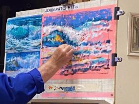
SEPTEMBER 2023 - JOHN PATCHETT
Our very own local pastel expert, John Patchett, gave us an excellent demonstration of his approach to seascapes last night.
John gave us some background to the history of pastel as a medium and description of the different surfaces to produce the best result.
John also shared that he rarely has a fixed idea of his desired outcome and prefers to have more than one reference photo and incorporates the aspects he feels suits his painting as it evolves. After doing a rough sketch in charcoal he builds layers of pastel from lightly applied colour, creating tones and shapes eventually finishing with the ‘lightest lights’ and his ‘darkest darks’.
He described his painting as going from an ‘ugly duckling’ stage gradually emerging into ‘adult swan’ - an interesting analogy!
His use of colour is exciting and inspiring.
We all gained a lot and had a very enjoyable evening.
Liz Hynes
APRIL 2023 - ROBERT SIMPSON
Robert Simpson - The Illustrations of John Tenniel
Robert gave us a fascinating insight into the work of local illustrator, John Tenniel (1820-1914)
John Tenniel had previously been a 'political cartoonist' and had worked alongside others, for PUNCH magazine. He was known to be 'serious / classically minded' so it may seem unlikely that he later became responsible for the illustrations in Lewis Carole's (1832 – 1898) Alice in Wonderland.
Very little 'illustrations' existed prior to the early 19th Century. We learned that the first 'modern' illustrated children's story book was in 1823 - The Brother's Grimm.
Robert explored the relationship between an 'author/writer' and an 'illustrator'.
The Illustrator can be known as 'The Invisible Man' in that his work is to depict the imagination and ideas of the author. He declines the limelight by complementing the thoughts and words of the author.
However, in earlier times this was reversed in that the person who illustrated led the plot and a writer was appointed secondary to this, with a process known as 'Writing Up'. Coombe was an example of this who wrote the words to accompany pre-existing images.
Later, George Cruik (early 1800's produced such detailed illustrations depicting London Life that no words were required. This become a weekly supplement which eventually could be put together as a complete book.
The last of this style of work was Robert Seymour (1798-1836) with a series of humorous sketches Seymour apparently committed suicide once the writer became the recognised 'Author' and the illustrator became secondary.
Other artists have tried to illustrate Lewis Carole's Alice stories.
Arthur Rackhall produced art work which he created using his own interpretation of characters but these did not achieve the same 'magic' .
Tenniel's satirical background enabled him to bring to life the imaginings of the author whose skill is to engage the child and almost collude with them to make a mockery of the adult world. The combination of words and illustration from Caroll and Tenniel achieved this in a way not previously realised.
Caroll recognised Tenniel as the best illustrator of his writing and felt Tenniel's work to be depicting his younger imaginations.
As a final local link Clay's of Bungay took over the publication of Alice in Wonderland in 1962.
Summarised report by Liz Hynes
february 2023 - graham webber
Graham Webber, ROI - Demonstration in oils, using a limited palette
Graham chose a simple photograph of Snape to use as a reference image and explained how he prefers to paint on MDF board, which had been primed in a neutral light grey colour. His limited palette consisted of Titanium White, Ultramarine Blue, Cadmium Red and Cadmium Yellow. When he produces a painting, he basically goes through three distinct stages. First, he establishes the composition by roughly sketching the main shapes with a dark mixture of blue, red and a touch of yellow, using a dry brush technique. He quickly moved on to the second stage, which was to block-in the initial sketch with diluted colour and as he put it, “get the values down”. He blocked in the sky with a mixture of blue and white, plus a little orange (yellow and red) which reduced the intensity of the blue sky. Graham started adding colour to different parts of the painting using his ‘family’ of colours to create and maintain a harmony throughout the painting. When blocking-in he is careful not to completely cover the whole surface of the board, but to have about 40% of the primed surface left unpainted. Graham constantly evaluates his work as it progresses making subtle adjustments as and where they are needed by adding touches of existing colour left on his mixing palette to create an atmospheric effect. He avoids muddy colours by making sure he only uses the tip of his bristle brush as the other end of the bristles, near the ferrule, tend to become clogged with a rather dirty mixture of colours. Having said that, he sometimes uses that sludge colour to modify strong colours. By placing colours on top of each other, rather than ‘blending’, he is able to create optical effects throughout the picture surface.
After the mid-way break, Graham decided to focus the attention to a ‘centre of interest’ by using much lighter and darker tones. Some suggested details were added like masts and the roof of a boatshed, but stressed that he likes to avoid his painting becoming too literal and as soon as the painting starts to look realistic to move to another area of the painting. This way he is able to preserve a variety of abstract qualities, which are sometimes the most exciting parts of a picture. Graham likes to work quickly and with a sense of urgency, so he can keep the painting looking energetic and lively.
By the end of the evening all those who attended agreed that they had been privileged to see a wonderful demonstration in oil painting unfold before their very eyes.
John Patchett. IEA
January 2023 - Rob Barnes
all images © Rob Barnes
http://www.robbarnesart.co.uk/
An evening with Rob Barnes - printmaker
Rob started the evening by explaining that his work is essentially about colour and light effects and also, strong silhouettes are an important feature of his work.
Using examples of some of his prints that he had brought along, he explained how he uses two lino blocks to create a final multi-coloured print.
Initially, Rob draws an image/design onto a lino block then goes over the pencil lines with an indelible blue marker pen. The first areas to be cut away will result in areas that will remain white. Subsequent areas to be cut away will be printed in a light coloured hue. This 'reduction' process is repeated using slightly darker colours and finally a layer of his darkest colour on the reduction block. He then uses his second lino block for the final details, which are usually printed in black.
Rob points out that registration is vitally important especially as editions of 50 prints can prove to be expensive if each time your print doesn't align exactly.
During the interval, Rob invited members to look through the many examples of his work.
The second half of the evening was highly entertaining with Rob answering members' questions and telling stories and recollections of his artistic journey.
The evening was a fascinating insight into the work of a master printmaker and one which all those who attended thoroughly enjoyed.
John Patchett
october 2022 - maggie saddulah
Portrait in oils by Maggie Saddulah
Professional portrait artist, Maggie Saddulah, gave an intriguing and informative demonstration using the ‘Zorn palette’, which was a palette used by the Swedish portrait painter Anders Zorn (1860 – 1920). The four colours he used were Ivory Black, Vermilion Red, Yellow Ochre and Flake White.
Using a muted green canvas surface, Maggie selected a portrait of a young woman to copy which she attached next to her canvas. She started her demonstration with the use of a pair of metal dividers to help her measure the proportions of the head accurately. She mixed a Burnt Umber colour and carefully placed a series of tiny brush marks to establish the proportions of the head and the position of the facial features. She repeated this measuring process all over her portrait until an image started to emerge.
After the coffee break, Maggie began to mix different tones and colours using a mixture of Stand Oil and solvent. She first applied colour to the darkest areas of the face before moving onto other areas of the portrait. Like most other artists she made sure she painted by ‘starting lean and finishing fat’. Maggie pointed out that the three colours can make a surprisingly wide range of subtle hues and tones when attempting a portrait painting.
Throughout the evening Maggie imparted lots of valuable information and everyone went away much wiser and privileged to have seen a wonderful demonstration in the art of portrait painting.
John Patchett
september 2022 - will harvey
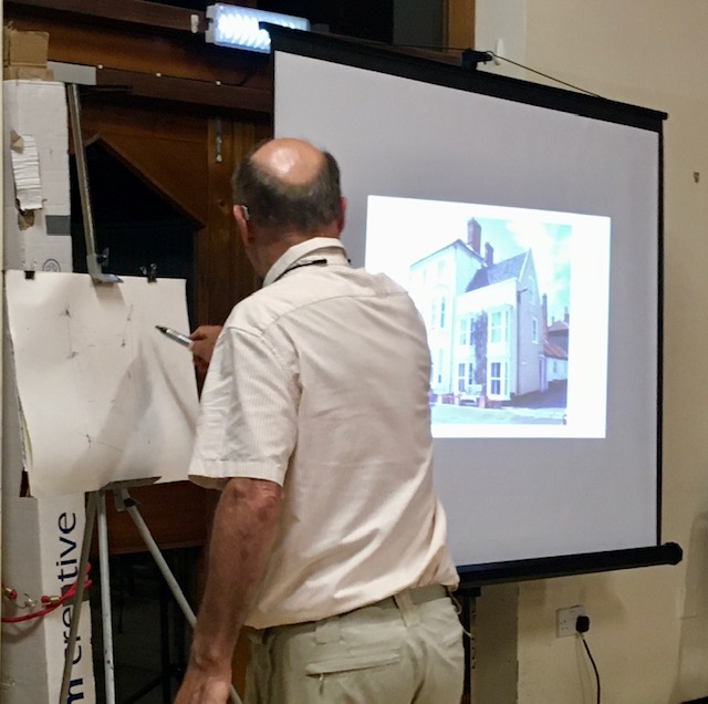
House portraits in Ink and Watercolour by professional artist Will Harvey
Initially, Will gave the audience a brief illustrated history of house portraiture. Using examples of his previous work, Will offered lots of good advice including “Simplification is key, it’s often what you leave out is as important as what you put in and make sure you leave something to the imagination”, “When you draw, make sure you ‘turn up the contrast’ to create more of a visual impact”. He later went on to discuss how, as artists, we need to make certain decisions such as who is it for? What size or scale are you about to attempt, what are the client’s requirements? What details should you include and of course the ‘style’ which you and the client have agreed upon? Composition is vitally important prior to embarking on any house portrait. Will prefers a ¾ view as it helps emphasise a sense of depth to the drawing. He demonstrated how using continuous lines can look uninteresting and how it is better to draw using ‘lost and found’ or ‘broken’ lines, as the viewer will mentally ‘fill in any gaps’. It is important to vary your weight of lines and fade out any lines that are near the edge of your page so your eyes don’t gravitate away from the main part of the composition. After the coffee break, Will went on to discuss a range of drawing equipment which he regularly uses, including the ‘Fude’ pen, which can create a mixture of different lines effortlessly. When using watercolour, Will uses a limited palette to create a ‘unity’ in his pen and wash drawings and suggests by just a Burnt Umber brown and a dark blue will allow you a good range of warm and cool hues and tones. Finally, Will stressed that scratches, drips, blots can contribute to giving your drawing an energy and character. All this excellent advice was delivered with amusing anecdotes and stories, which made for a most entertaining evening.
John Patchett
JUNE 2022 - PETER WEISS
An illustrated talk on ‘Drawing the Head’ by Peter Weiss
Peter started the evening by explaining the structure and proportion of the head. Using a series of large preprepared drawings to act as visual aids, he showed how the major muscles of the face needed to be understood as they create people’s facial expression. Peter emphasised the importance of light and shade to create form and structure and to make your drawings appear three dimensional. Using a single light source can create ‘drama’ in a portrait. Peter went to great lengths to explain the proportions of the head and how it can be divided into 3 distinct thirds. He said, “These are major rules for measuring areas of the face”. Peter introduced us to the features of the face, namely the ears, eyes, nose and mouth and stressed the importance of positioning them correctly and accurately. He went on to explain in detail the ‘characteristics’ of the facial features and showed how to depict them convincingly.
It was a very informative illustrated talk and by the end of the evening we all felt that our understanding of the anatomy of the head and face had been significantly improved.
John Patchett IEA.
may 2022 - rachel thomas
Mixed media demonstration by professional artist Rachel Thomas
Rachel is a contemporary artist who works predominately in oils, watercolour and mixed media. She especially enjoys movement and patterns in nature, which invariably come alive in her capable hands.
After a brief introduction, Rachel set up a still life arrangement consisting of flowers, natural objects and decorative drapes, which she was to use as a reference throughout her demonstration.
She started demonstration piece on an expensive piece of heavy watercolour paper which had a pronounced textured surface. Her initial drawing was based on shapes, patterns and forms which she observed in the still life arrangement.
Over her drawing, she applied loose layers of free-flowing watercolour allowing dribbles, runs and happy accidents to be all part of the underpainting. The main colour she used for this was Cobalt Turquoise, one of her favourite colours.
Rachel’s demonstration painting developed gradually with overlapping lines and shapes, which related to her response, feelings and acute observations of the still life. Colour harmony and making sure the composition is “how you want it to be” was of paramount importance. Rachel went onto creating a wonderful array of abstract shapes and colours, which allowed her to make changes relatively easily.
The addition of water-soluble coloured pencils created strong linear shapes, which pulled and pushed the composition into a myriad of different possibilities.
Throughout the demonstration Rachel maintained an interesting and entertaining dialogue and all those attending witnessed an evening of unique and inspirational creativity.
John Patchett IEA
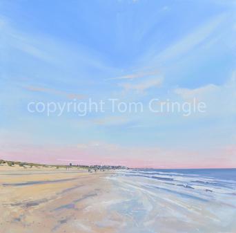
APRIL 2022 - TOM CRINGLE
Demonstration by Tom Cringle using acrylic
Members very much enjoyed Tom's demonstration of a Southwold scene in acrylic.
Tom has very kindly sent notes about his process, which can be read below.
Step 1.Create a horizon. Use a ruler. Consider the VP. Where the centre is… where the focal point will be?
Step 2.Look for perspective lines, simplify them to suit your composition. Cloud. Shore line. Dunes. Trees. Etc…
Step 3.Consider where people go and what height they are. The eye level and how the relates to the other parts of the composition. Use simple lines and don’t be afraid to use a ruler.
Step 4.Introduce basic colour wash. Top to bottom Blues*, Crimson etc… lots of white. Start from the horizon and work up then horizon and work down. Use only 3 or 4 colours. This is a wash! The basis of the painting. Big brush.
Step 5.Then repeat with smaller brushes. Work about and below the horizon. Look for shadows and reflections.
Step 6.Work on the dunes (trees) add the darker area of sea. Ultramarine, bright green, orange, crimson, yellow.
Step 7.Work on the sand and then the larger areas of water. Naples, orange, white some crimson, and raw umber.
Step 8.Add the white highlights to the sea and at the sky. Add darker shows of waves too.
Step 9.Add people, umbrellas etc… details. Refer back to step 1 and 2 to make sure reactive heights and sizes are all fine.
Step 10.Refine and tie it all together.
* Kings Blue, Cobalt and Cerulean. I use Golden and Old Holland.
march 2022 - colin ayers
Members: Colin Ayers has very kindly offered the society access to 7 step-by-step guides to watercolour painting (various locations). If you would like access and are a current memberplease contact Sally Ladbrooke sally.ladbrooke889@googlemail.com
Demonstration by Colin Ayers using watercolours
Colin mainly paints landscapes and seascapes but for this evening, he decided to paint a street scene. He emphasised the importance of ‘tone’ when painting. He prefers rough watercolour paper as this suits his style. Starting by splattering clean water over the area of the sky, he then adds diluted Raw Sienna and Ultramarine Blue to create a loose ‘under-wash’. He uses 300gm paper which eliminates the need to stretch the paper first. Using a hairdryer, Colin dried off the paper before the next stage.
Tip: Use tube paint rather than pan paint – you can produce quick, rich washes and your brushes will last longer!
Burnt Sienna and Ultramarine are mixed together to block in the buildings. Sometimes he uses wet onto wet and other times wet onto dry to get different effects. Colin builds up the washes and dries it completely before going onto the next stage. Cobalt Blue mixed with Burnt Sienna is used for some of the roofs of the buildings. Wetting the area to be painted first allows the paint to go on smoothly and more fluidly.
Tip: Use sable/synthetic brushes as they hold water well and also have the ability to retain a pointed tip.
Adding green foliage to the painting, Colin uses ‘Sap Green’ as it is a green compatible with Ultramarine Blue. Colin puts in ‘shadow areas’ using a mix of Ultramarine Blue and Burnt Sienna, quite diluted, when the paper is dry (wet onto dry technique). When painting trees/foliage in the middle distance, Colin uses the side of his brush to obtain suggested marks. Dry brush technique is used in the foreground to create ‘lost and found’ brush strokes. Details and figures were added last but “it is important to connect cars and people to shadows to unify the overall effect”. Finally, telegraph lines are placed in the sky using the edge of a playing card which makes fine ‘lost and found’ lines.
Colin finished his demonstration piece and all those who attended were privileged to a master class in the art of watercolour painting.
John Patchett, IEA
february 2022 - john shave
Demonstration by John Shave, “A coastal scene with boat”, in oils
After a brief introduction, John started the evening’s demonstration by explaining his approach to oil painting which has a strong emphasis on tonal relationships and abstract possibilities. Using a reference photograph of a Thames Barge silhouetted against the light, he first established the dark areas of his picture. For this he used a very dark hue, not familiar to most of the audience, called Casel Earth, by Lucas. John worked out his composition with carefully placed marks using a mixture of oil paint and his favourite ‘medium’ (genuine turpentine plus 5% stand oil). After applying a thin dark wash all-over his board, he used a thicker consistency of paint, of subtle dark and mid tones of blue and blue-violet for the middle distance. Lost and found vertical lines, suggesting guy ropes in the foreground were then painted using Magenta, Blue and Cassel Earth. John explained how by putting different colours on either side of this flat hog hair brush he is able to vary his colours by simply turning his brush around as his painting progresses. Working from ‘thin’ to ‘fat’, John applied deft, single strokes to all the key elements of his composition. He advocates working on all parts of the painting at the same time, making adjustments as the work progresses and evolves. As john says,” It’s a question of working backwards and forwards”. Throughout the course of the demonstration, John altered and adjusted tones, hues and most importantly, ‘edges’, adding marks that enhanced his painting. Towards the end of the evening, he was applying quite thick paint strokes so they sat easily on top of previously applied layers of paint.
By the end of the evening, all those in attendance agreed that they had witnessed a high calibre demonstration by an exceptional artist who imparted his knowledge generously and maintained a delightful rapport with his audience.
John Patchett
JANUARY 2022 - JOHN PATCHETT
On Wednesday 5th January professional artist John Patchett gave a pastel painting demonstration for members and guests at the first of our monthly meetings for 2022.
He showed how he starts a painting with a charcoal sketch then slowly builds layers of delicately applied pastel to achieve a wide range of effects.
Throughout the demonstration John gave everyone a unique insight into his approach to his craft, as well as some useful 'tips'.
John's subject matter was a view along Blackshore, Southwold Harbour, a location with which he is very familiar.
By the end of the evening he had completed his picture, which is now on display at The Southwold Gallery.
december 2021 - James Power
Demonstration by equestrian artist, James (Jim) Power
James is a member of the Society of Equestrian Artists and after a brief introduction, James explained that the evening was going to be made up of two sessions. Firstly, Jim began to draw a basic horse, using different measuring devices to obtain the correct proportions. Different parts of the horse’s anatomy were explained and how to make the drawing 3D, using light and dark tones.
Jim went on to demonstrate that using a series of circles and curves, drawing a horse becomes relatively easy, starting with a kidney shape. Constructing a horse’s head was explained and Jim effortlessly produced a drawing of a head of a horse by using deft marks and shaded areas.
After a mid-evening refreshment break, Jim gave a demonstration using oils and a brief explanation of the colours he uses and how he arranges the warm and cool colours on his palette. He started by “mapping out” the basic outline of a horse using diluted Burnt Umber. Broad, dark areas were put in first following the direction of the muscles, ribs and surface of the horse to suggest “form”. Using King’s Blue, which is akin to Ultra Marine Blue mixed with white, Jim suggested a sky for the background, which made the brown colour of the horse more defined.
Advice on how to hold the brush and when to use the different kinds of brushes were put into practice, creating a wonderful array of painterly effects. Jim finished his painting using smaller sized brushes to make some areas more refined.
By the end of the evening, everyone was treated to a thoroughly enthralling demonstration by one of the country’s leading equestrian artists.
John Patchett, IEA
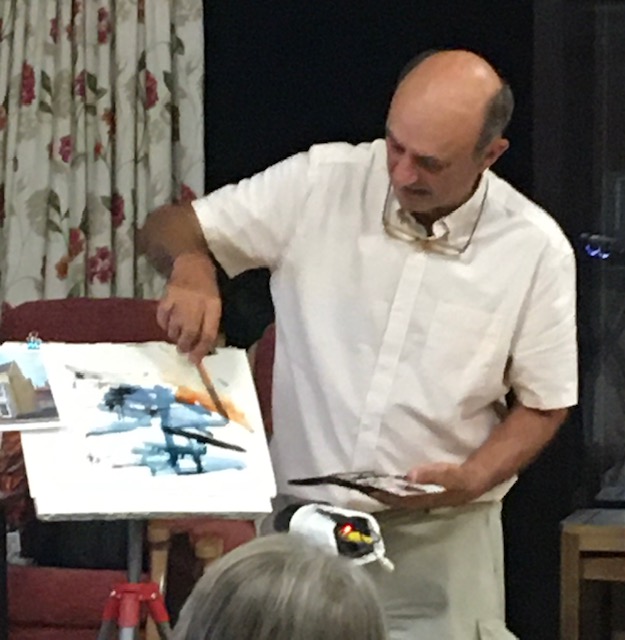
October 2021 - Paul Zawadzki
Demonstration by Bungay artist, Paul Zawadzki, using oil paint, Liquin and turps
Contemporary artist, Paul Zawadski, likes to, as he puts it, “embrace the happy accident”. He often starts with random experimentation and spontaneity until he sees unexpected possibilities starting to emerge. He likes to keep an open mind as to how the direction of his work might progress. As a musician, as well as a visual artist, he sees a fusion of the two genres and how the creative process emerges from abstract shapes and sounds. Drips, splashes and blots all feature in the initial stages of his work and gradually, he starts to make sense of the visual effects that begin to emerge.
The evening was split into two distinctive halves: -
Part one – Paul told us of his background, training, various influences and the different approaches over the years, by showing us a examples of his work.
Part two - Demonstration using “Liquin”, turps and oil paint. Paul started by staining a canvas with Thalo Blue then using more turps to create drips and dribbles. He then added Crimson Lake to the blue mixture by splattering with a stiff haired bristle brush to create an overall texture. Then by adding some pink dribbles from the top edge of the painting, he created stripes that appeared from the top to the bottom of the canvas.
At this stage, Paul began to makes decisions about what the work might suggest to him – in this case it was a forest scene. Using the vertical drips as a guide, Paul worked tree shapes into the surface using dry scumbled marks to establish a sense of depth.
Paul often uses a mirror to see his work as if he’s looking at it from a distance. His work constantly evolves and he makes decisions as areas suggest different things. As the work progressed, Paul emphasised certain areas with stronger, lighter paint to create focal points - blotting heavy shapes in the foreground, which is another technique Paul uses as further pictorial possibilities.
By the end of an enlightened evening, we all had experienced a demonstration of energetic, creative activity by an unconventional and personable artist.
John Patchett, IEA
march 2020 - sue williams
Demonstration in acrylic inks
Sue started the evening by showing us some of the different inks she uses and the mixing palette she prefers, which was a plastic ‘toy type’ with deep wells.
There were three completely different demonstrations for our members to enjoy.
i) Sue began by sketching a drawing of an old cottage surrounded by trees, using Sepia Ink, which becomes waterproof when dry. Sue used a cocktail stick or coffee stirrer with which to draw which created a lively “lost and found” range of marks. Using ‘Bockingford’ watercolour paper, she created a bold drawing which made use of the many ways to make marks (on a dry surface). Sue added water to the surface of the paper and worked diluted coloured inks over the damp areas to achieve soft edges. The painting developed using a watercolour technique and the washes gradually became richer and the tones stronger. She explained that corrections could be made using white ink, which is opaque and has good covering properties.
ii) For her second demonstration, Sue used a different ink, which wss slightly thicker in consistency. The subject was a floral arrangement. The colours were much more opaque and could be manipulated quite easily when working ‘wet into wet’. This time she worked on a heavyweight Bockingford paper. Sue showed us how to blend colours, control bleeds and manipulate complex shapes and forms. Her mastery of the medium was very apparent and everyone was transfixed as she brought the iris painting to life.
iii) For her third demonstration, Sue used a coffee stirrer and sketched a group of “pigs” on dry paper, using ‘Payne’s Grey’. To soften some of her lines, she dampened the paper next to the lines to create “bleeds”. Racing against time, Sue quickly blocked in thicker colours as the group of pigs slowly came to life.
By the end of the evening the audience had gained a real insight into using acrylic inks and a unique opportunity of seeing a professional artist demonstrate her considerable talents.
John Patchett, IEA
february 2020 - lisa henshall
Demonstration in abstract acrylics
After a brief introduction Harleston artist Lisa talked about her artistic background and her approach to abstract art which in her case incorporates the use of ‘layers’. These layers have now become an important element in her work. Originally, she began her art career producing realistic drawings and paintings but despite being popular, became unfulfilling after a time. A change from oil painting to acrylics helped make this transition and enabled her to build up her important layers. She often leaves her work alone to dry and after a period of careful consideration returns to a painting to add further layers as and where needed. Her initial layer sometimes makes reference to things observed or incorporated fragmented shapes. She has a preference for dark backgrounds on which she can apply subsequent overlays. Semi obliterating previous layers and responding to the changes she makes is key to the development of her painting. Using the wrong end of her paint brushes to draw into wet paint creates lines that work with shapes left from the layer underneath. “Letting things happen and reacting to change is an important part of the creative process”, Lisa explained. Her work uses a variety of techniques applied on top of previous layers. Texture and colour interact with form, shape and composition to create an overall ‘visual conversation’. Some of the different materials like oil bars, acrylic ink, Brusho dyes and collage all create interesting and unique mixed media sensations and outcomes. By the end of an enthralling evening everyone had gained a real insight into the working process and practice of a very accomplished abstract artist who had entertained us with her witty and engaging persona.
John Patchett, IEA
January 2020 - Andrew Pitt
"Reflections in Water" - watercolour
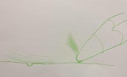
Using a simple diagram, Andrew explained the basic principles of drawing reflections in perspective. He explained how mirror images tend to go down vertically into the water; however, we also see reflections which appear on the surface of the water. As surfaces have ripples, the reflections often become distorted, elongated or broken.
Another important "rule" to be aware of is that the reflection of a dark object appears slightly lighter in the water and a light object makes a slightly darker reflection. There is no substitute for direct observation but knowing these simple rules will help you to see these things taking place before your eyes. Andrew began to draw his composition using a simple line sketch. He explained the range of colours he used, demonstrated how to start a watercolour painting and offered tips as he went. He emphasised the importance of retaining the freshness of a piece of work; don't overwork any area and try a mark just once.
Throughout the "demo" Andrew kept everyone entertained with humorous anecdotes as well as explaining the "do's" and "don’ts" of using watercolours. Andrew's watercolour style is confident and assured and everyone was treated to a highly entertaining and informative evening.
John Patchett